The editor of the Forms module:
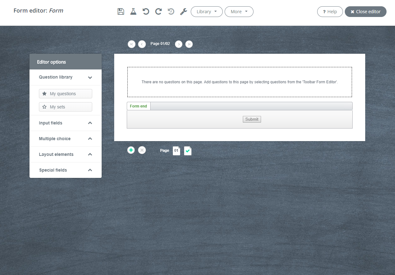
In this screen, you will see:
- An editing menu in the header with grey icons, a drop-down menu and one grey button.
- The tool palette Editor options on the left side of the screen.
- The canvas with question fields in the middle of the screen.
- The footer with i.a. a plus icon and the number of pages.
1. The editing menu in the header
The editing menu in the header looks like this:
| Button | Function |
 |
Save Spotler saves automatically, but the safest way is still to save your form yourself every now and then. This way, you will accumulate multiple versions of your form. |
 |
Test form You open a preview of your form and test your form by completing the fields and hitting the submit button. |
 |
Undo Does your change not work like you expected? With this function, you can undo the change. |
 |
Redo Did you undo one too many steps? This function allows you to redo the action again. |
 |
Load previous version Spotler automatically saves changes after 10 actions and/or 5 minutes. Using this drop-down menu, you can load both automatically saved versions and versions you saved yourself. |
 |
Settings This option consists of two parts:
|
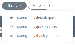
Manage my standard questions
This icon allows you to see an overview of available Standard questions and to rename or delete them. Standard questions are convenient when creating forms that use the same questions. This way, you won't have to type them over and over.
If you right-click on a question field, you can save a question as a Standard question.
Manage my question sets
You can add Standard questions to a question set using your right-click menu. If you are creating a new form, this will allow you to add a complete question set in one go. This can come in handy when you need to keep asking the same basic questions on a form, such as first name and last name.
Manage my 'Thank you' texts
This icon allows you to add standard 'Thank you' texts to your form.
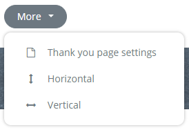
Setting a 'Thank you' page
There are three options for setting a 'Thank you' page:
- Place a 'Thank you' text in the form
- A separate 'Thank you' page in Spotler
An external web page.
Horizontal
View where questions and answers are side by side.
Vertical
View where questions and answers are placed underneath each other.
2. Tool palette Editor-options
The tool palette Editor options looks like this:
The tool palette works as a drag & drop editor. This means that you can use your mouse to drag elements. Drag question fields from the tool palette to the canvas.
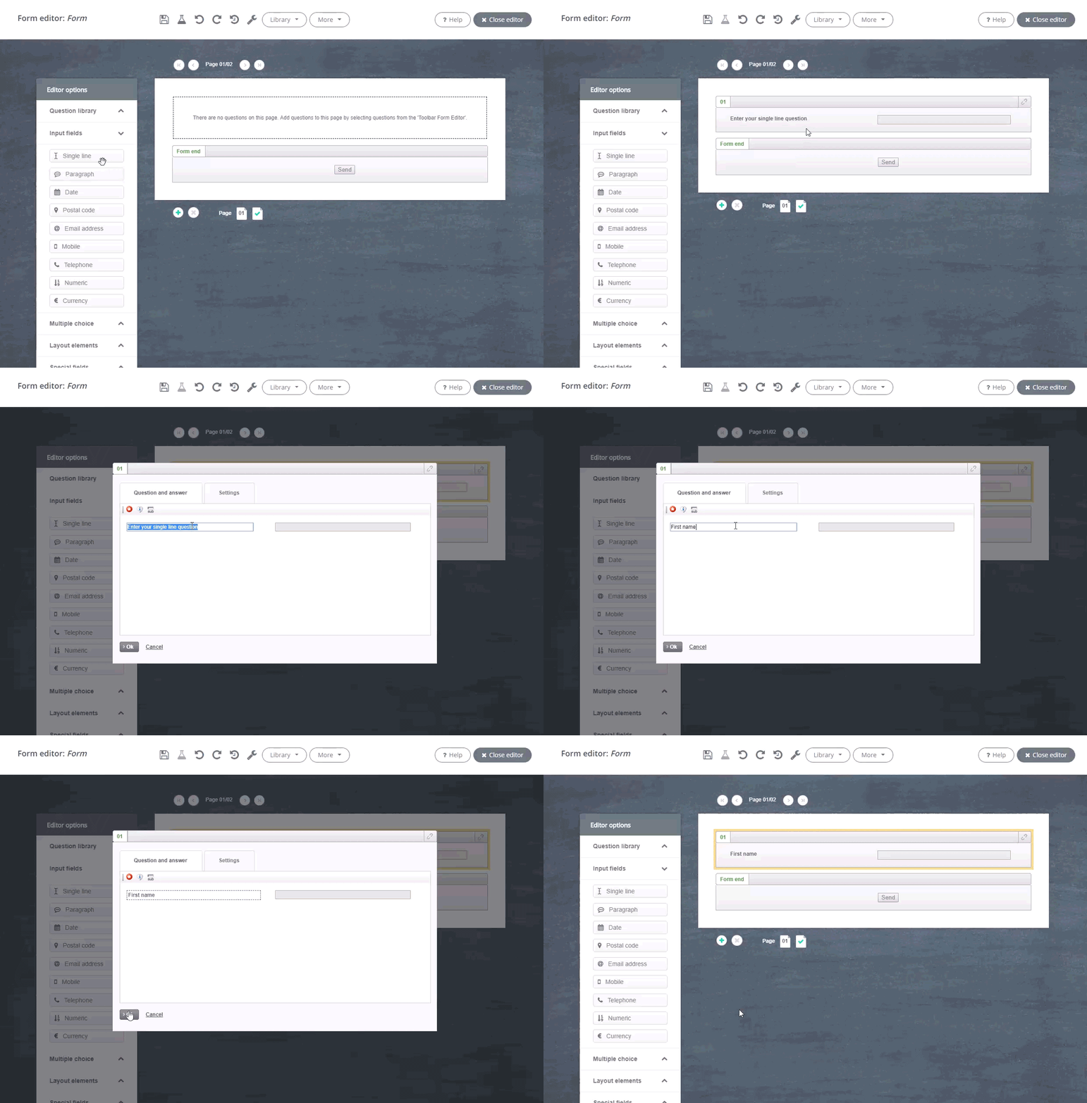
Explanation of the elements:
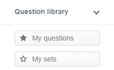 |
Drag your own questions or your question sets from the Question library drop-down menu to the canvas. |
|
From the Input fields drop-down menu, you can drag the most common question fields to the canvas. The question field Text input can be used for all types of open questions. |
|
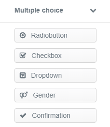 |
From the Multiple-choice questions drop-down menu, you can drag the most common multiple-choice questions to the canvas. For instance, questions that have check boxes or radio buttons. |
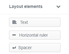 |
Use the Layout rules drop-down menu to categorize questions with text headers, white lines and horizontal lines. |
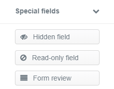 |
From the Special fields drop-down menu, you can drag three advanced functions to the canvas. Use the Hidden field function if you want to save a value in the reports of your form without the respondent seeing this. A Read-only field allows the respondent to see pre-completed data without being able to edit it, such as their client number. And Form check shows questions and answers from previous pages. |
3. The canvas with content fields
Once you have dragged question fields from the tool palette to the canvas, there are three ways to edit them:
- You can move the fields to a different position within your form. Move your cursor over the top of the question field until the navigation symbol (consisting of four arrows) appears. Next, click and hold the question field with your cursor and drag it to the desired position within your form.
- In Spotler, you can link fields to database fields by clicking on the paper clip in the upper-right corner of the question field.
- You can edit fields by double-clicking in the field.
- You can edit fields by right-clicking in the field.
Linking with the database
The paper clip in the upper-right corner of the question field looks like this:

If you click on the paper clip, a pop-up will appear. From this pop-up, you can link questions to a database field. If you want the answers of a form to be saved or modified in the database (possible for Registration forms and Update profile information forms), it is important that you link the questions to a database field. This way, the value is saved in the correct database field. For multiple-choice questions it is important to also link the answer options.
 |
A link allows you to pre-complete data If there is a link, data can be pre-completed if the respondent's information is already available in the database. This makes the form user-friendly, which contributes to a higher conversion. All the respondent has to do is verify the data, instead of completing everything. |
Editing with double-click menu
The menu which appears after double-clicking is different for each question field. For instance, the double-click menu of the multiple-choice question Checkbox looks like this:
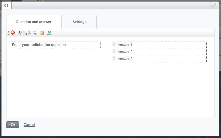
From this menu, you can:
- Enter and edit all your questions and answering options in the Question and answer.
- Enter and edit question-specific settings in the Settings.
 |
The Add, Delete and Move up and down menu In the Format question and answer screen, right-click the field with the three standard answering options. A pop-up will appear that allows you to add or delete answering options, or to easily change the sequence of the answering options. This function works with any question that has multiple answering options. |
Question and answer window
Explanation of the elements you can see in the upper-left corner:
| Icon | Explanation |
 |
Mandatory Use this icon to make a question mandatory. An asterisk (*) will appear at the end of the question. |
 |
Help text Add an explanation to clarify the question. If you have enabled a help text, the icon will appear next to the question. |
 |
Sublabel Sublabel for explanation of an input field. You can give an example of what the answer should look like. |
 |
Other, ... For adding an Other, which is: input field with a radio button or check box question. |
 |
Toggle This function allows you to change a check box question into a radio button question and vice versa. |
 |
Quick paste This option allows you to paste multiple answering options from the database in one go, such as a country list or interests. That way, you won't have to re-type these answering options. |
 |
Sort alphabetically Sort your answers alphabetically in one click. |
 |
Align answer options side by side This option is visible at the radio button and checkbox questions. When you have a list of options, it may be better for readability to align the options next to each other. |
Settings
In the Settings screen, indicate how you want to display error texts, how you want to save the answers to the questions and what the validation looks like. Because these settings differ per type of question, the Settings screen is not the same for every type of question.
A few things to watch out for are:
Error texts
Error texts are the texts that are displayed if a respondent of the form or survey did not answer or did not answer correctly. Error texts are already set by default, but you can change them. Maybe you communicate in a different way. And do you use forms in different languages? Then keep in mind that you also translate the error texts.
You can adjust the error texts as follows:
- Double-click a field in the form.
- Click the Settings tab.
- Here it is possible to adjust the text in the input fields.
Validation
By default, a validation is applied to a number of input fields. This means that a check is done as standard whether the field is filled in correctly. This happens with the fields: Postal code, Telephone and Mobile. By default, the validation is based on the language of your account. You can change this to another language via the input field settings.
An example:
- Drag a Postal code field onto the canvas
- Double click on the input field
- A popup opens. Click the Settings tab.
- You can select a different language via the drop-down menu under Language.
If you choose the option Other then you have the option to set a Regular expression yourself. A Regular expression can consist of letters and numbers. This combination can ensure that a check takes place on the answer.
Below you see an example of a Regular expression for a English Postal code. Numbers and letters indicate what a English postal code must meet in terms of structure.
Language settings country list
The Country entry field is a standard country list that is shown on a form in a drop-down menu:
The language in which the countries are displayed is linked to the language of your account. If you create a form in a different language, you can adjust this in the settings of the question.
- Drag the Country input field onto your canvas.
- Double-click the Country field. A popup opens.
- Click the Settings tab.
- Here you will see a drop-down menu under Regional Settings.
- Select the desired language.
Save answer as
Sometimes it is desirable to formulate an answer differently on the front of the form than on the background. Various situations can be imagined.
One example is a training registration page. In the foreground you see data written in full with the day before.
If you want to use date fields for segmentations and triggering automatic campaigns, for example, the date must comply with a certain format in the database. Thursday the 19th of January 2023 cannot be translated to a date field, but 01-19-2023 can. On a form you can determine that a field must be written in the background in a different way. You do this as follows:
- Double-click the field where you want to save the answer options in a different way.
- Click the Settings tab.
- Enter the answers as you want to save them in the database.
- Click OK.
Editing with right-click menu
You can also edit question fields by right-clicking in the fields. You will then see the following menu:
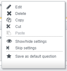
Explanation of the elements:
| Icon | Explanation |
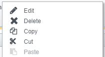 |
Standard editing functions These five functions allow you to carry out the standard editing functions. |
 |
Show/hide
Suppose you include the following question and answering options in your form:
What did you think of the white paper?
You can imagine that you would like to know why someone thought the white paper was bad when they selected Bad as the answer. For instance, you would want to ask the follow-up question: What was it that you didn't like about the white paper? The Show/Hide function allows you to only show this question when someone ticked the Bad box. |
 |
Skip
This icon will only be visible if the form consists of multiple pages. Suppose you ask the question What did you think of the white paper? and two follow-up questions with the answer Good and two follow-up questions with the answer Bad. You could place those follow-up questions on different pages. The Skip function allows you to indicate which page (with the correct follow-up questions) should be shown with an answer. Good to know! The Show/Hide function and Skip function can't be used simultaneously on one question. |
 |
Save standard question
If you have drafted a question on your form that you would like to use again on other forms in the future, you can select Save standard question from the menu after you have right-clicked. An input field will appear in the menu. Enter a name for the standard question here. By clicking the green check icon, the question will be added to My questions. |
Show/hide settings
If you want to show a follow-up question based on a specific answer. you can do this by right-clicking on the multiplechoice question for which you want to set up Show/hide. When you click on Show/hide settings, a pop-up will appear. This pop-up shows you the answers to your question, with the follow-up questions on the right side. If you want to show a follow-up question based on a specific answer, click on the relevant question number. A red symbol of an eye will appear above the question. Be sure to save the form before testing how the Show/hide settings works on your form.
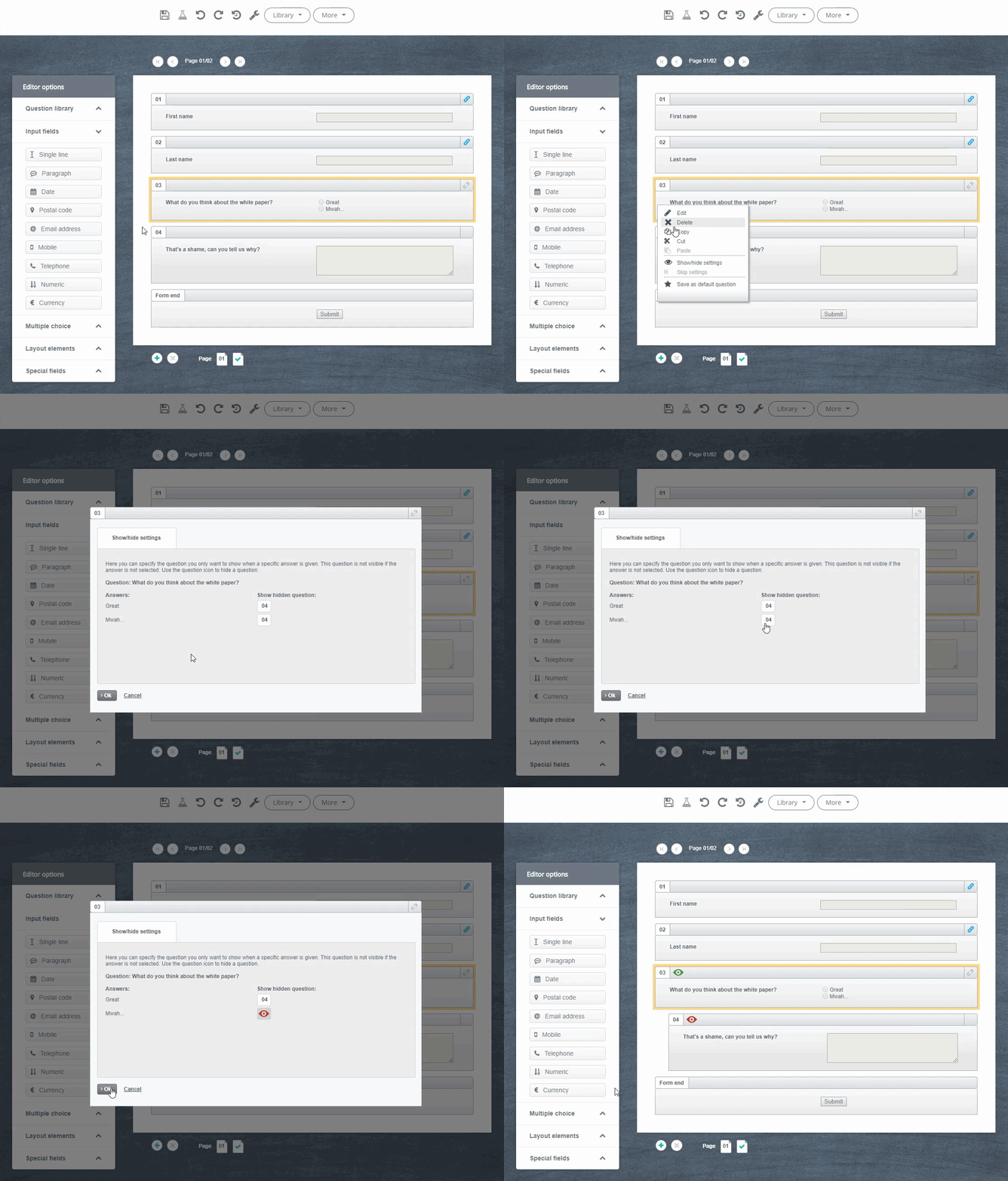
4. The editing menu in the footer
The footer looks like this:

Explanation of the elements:
Adjusting form buttons
Double-click the content field Form end and the Button management menu will appear. Click the button you wish to change, and an input field will appear in which you can type its new name. Commonly used alternatives are Subscribe and Download white paper. Always choose a name that fits with your form.
Add pages
At the bottom of the form, you have the possibility to add more pages. Click on the plus button.
Delete pages
Did you add a page too many? You can remove pages by clicking the red X button.
Overview of pages
This is an overview of all the pages in your form.
Green checkmark
The green checkmark allows you to open the editor for the 'Thank you' text. On the left side of the canvas, you will see the following tool palette:
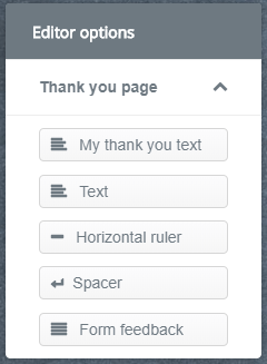
In addition to the standard elements for creating your 'Thank you' text, you will find a My 'Thank you' text option. If you want to make use of your personal 'Thank you' text, you will have to save it first.
 |
Saving personal 'Thank you' text Double-click the content field Thank you! Your details were submitted successfully and enter your own text. Next, right-click the content field and the options Edit, Delete and Save 'Thank you' text will appear. Click on Save 'Thank you' text and give your text a name. Now you can select your personal 'Thank you' text through the content field My 'Thank you' text. As with standard questions, this can be useful for reusing frequently used texts on forms. |