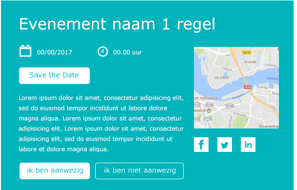
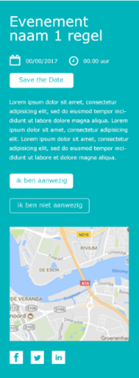
In your newsletter template, images on a portable device are scaled at 100% width. It is therefore possible that the image from your desktop is enlarged on portable devices, which could result in a loss of quality.
Below an example of what this can look like.

Desktop version

Portable device version
In the version for portable devices, you can see that the image takes up the entire width. Since the images in your template are shown at 100% width on portable devices, the images will become larger than when shown on a desktop. To make sure that images remain clear on portable devices, upload an image that is twice the size of what you would need for desktop.
For example: if you need an image width of 300 px in your template, you will need 600 px for portable devices. As such, you shouldn't crop your image to the exact width of the template. This isn't necessary either, because Spotler automatically scales the image to the correct size based on the width in the template.
Read more about placing images in your template in the article: How do I replace an image in my message?